Patient engagement isn’t a slogan; it’s the difference between missed visits and timely care.
A good app removes friction at every step: book, join, message, pay, follow up. However, most healthcare software solutions used today often overlook several key features that can improve conversion.
Therefore, this blog takes a closer look at healthcare solutions people actually use. Continue reading as we explore these solutions, focusing on key features that matter. Let’s get started.
Must-have Features for Patient Engagement in Healthcare Mobile Apps
Frictionless Onboarding (for People to Sign In)
Keep account creation short. Support email, phone, or federated sign-in; confirm identity only when the task truly needs it.
Explain consent in plain language and let users set communication preferences up front. If caregivers are common in your population, add secure proxy access from the start (parent, spouse, or trusted friend) with clear permissions.
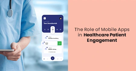
Appointments that Stick
Let patients find, book, and reschedule in a few taps. Show real-time availability, waitlist options, travel time, and pre-visit tasks (forms, prep).
Sync to device calendars with reminders that include location or a “Join video” button. When a slot opens sooner, offer an instant swap; no phone calls, no hold music.
However, if you’re confused about the process, it’s best to connect with a mobile app development company in the USA to help you through the process.
Tele-health that “Just Works”
One button to join. Run a quick camera/mic check in-app, offer an audio-only fallback for weak networks, and keep the screen steady when video quality shifts.
Add captions, a chat back-channel for links and instructions, and a simple way to add a caregiver to the visit. After the call, show a concise summary and next steps.
Medications & Care Plans that are Easy to Follow
Show a clean medication list with photos, dosing, and “why you take it.” Reminders should adapt to the user’s schedule and pause during travel.
Tie refills to preferred pharmacies, and let patients request a renewal without typing a number. For procedures or chronic care, turn the plan into small checklists with friendly language and short videos instead of dense PDFs.
Records & Results – Explained in Real Time
People want answers, not file trees. Show labs, imaging, and visit notes on a simple timeline; surface trends with plain-English flags and short, clinician-approved explanations.
Let users export a shareable PDF or a time-boxed link for a second opinion. If results are released before clinician review, display a calm “What this usually means” card to reduce worry.
7 Features to Secure the Future of Your Healthcare Mobile Apps
#1 Payments made simple
Combine estimates, insurance, and bills in one place. Show expected copay before a visit, support common wallets and cards, and let users set small payment plans when needed. Receipts should land instantly, and statements should match what appears in email and mail, with no surprises or support tickets.
#2 Accessibility and language support
Design for real hands and eyes: large tap targets, clear contrast, dynamic type, screen-reader labels, and focus states. Offer at least the top languages you serve and keep translations human, not machine-awkward. Accessibility isn’t a checkbox; it’s how you make the app feel calm and dependable for everyone.
#3 Notifications that respect attention
Not every event deserves a push. Let patients choose their preferred channels (push, SMS, email), quiet hours, and topics that interest them, such as reminders, results posted, and messages from care teams. Summarize weekly when possible; a single digest beats a dozen pings.
#4 Data privacy and security by design
Encrypt at rest and in transit, log access, and keep sessions short on shared devices. Minimize what you collect, explain why you collect it, and make opt-outs obvious. Provide an “export my data” path and a clear policy on how long you retain messages and documents. Quiet security is the kind that users trust.
#5 Offline-first basics
Hospitals and elevators kill connections. Cache the essentials: appointments, instructions, barcodes for check-in, and med lists, so the app stays useful. Queue uploads (photos, forms, messages) and send them automatically when the signal returns.
#6 Wearables and device data
If you accept steps, heart rate, glucose, or BP, show exactly how that data helps care. Make opt-in granular, summarize signals simply, and route alerts to people who can act. Raw streams without meaning create noise; tight loops create value.
#7 Admin tools your staff will love
Patient UX collapses if the staff tools are clunky. Give teams a unified inbox with triage rules, templates for common replies, and a clear SLA view. Pre-visit tasks should flow into the EHR without retyping. When staff can move faster, patients feel it.
Shipping Healthcare Apps without the Rework
Start with clear objectives – one clinic, one specialty, one flow (e.g., “book → visit → pay”). Measure success with adoption, no-show rate, message response time, and refill adherence.
Add features only when they move those numbers. Mobile app development companies can help you pick the right integrations, keep the UI simple, and align the app with your clinical and billing reality.
When done right, here’s what the features could look like:
- One-tap join for telehealth with audio fallback
- Real-time scheduling and instant reschedule/waitlist
- Medication reminders and easy refills
- Secure messaging with smart routing and context
- Clean results timeline with plain-language notes
- Accessibility, language support, and proxy access
Bottom Line
Patients stick with apps that save time, reduce worry, and give clear next steps. Build for that, measure it honestly, and keep the experience steady. The result is higher engagement, fewer calls, and care teams who can focus on patients, not password resets and paperwork.